The real colors of the moon
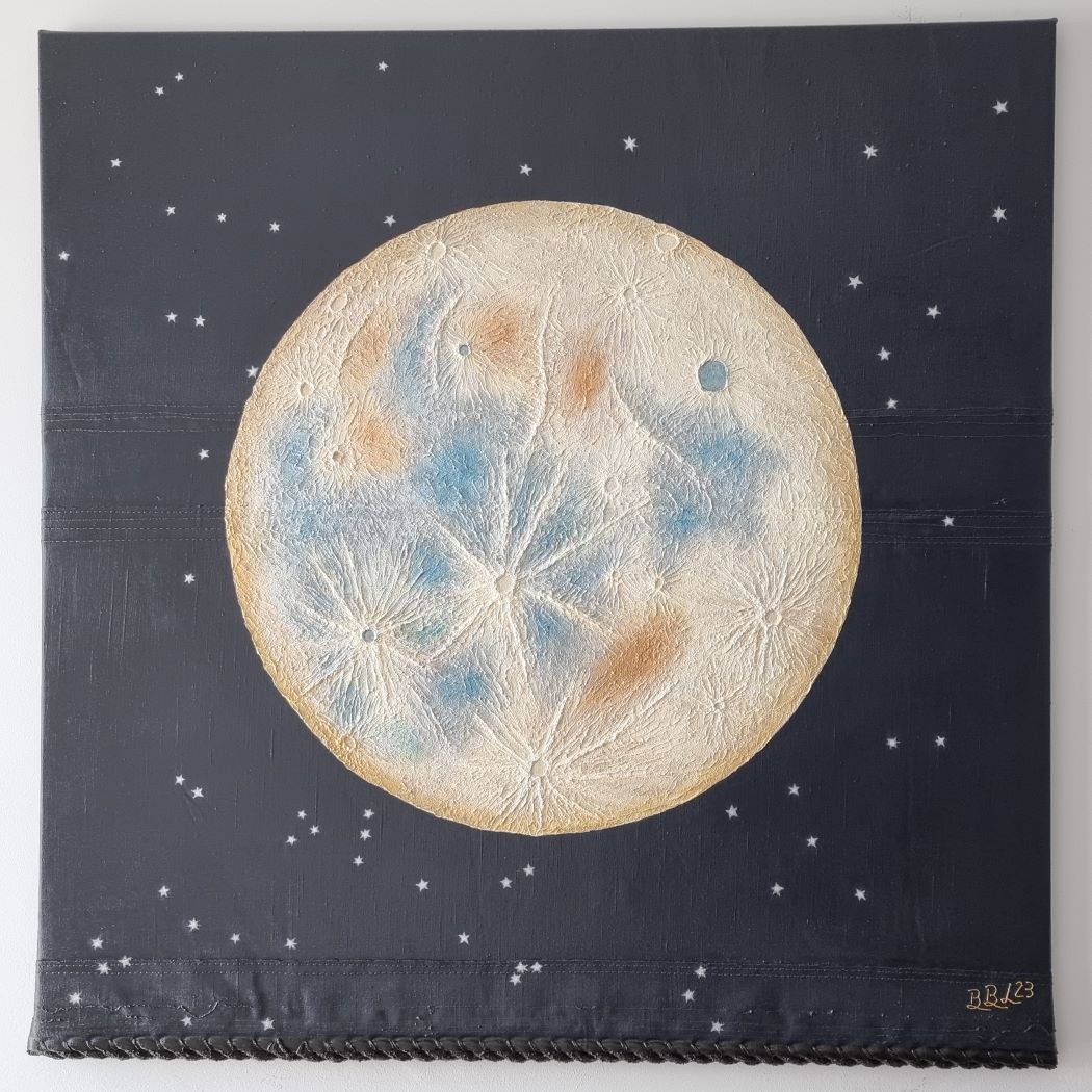
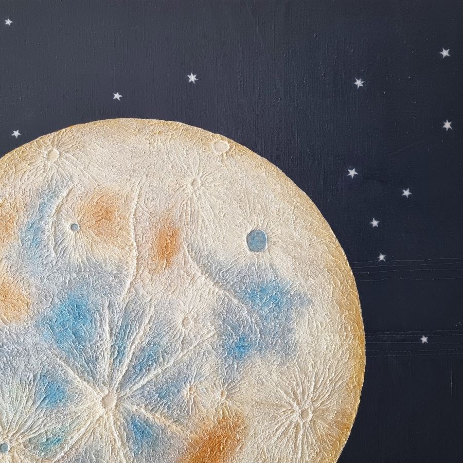
The moon is not so pale as it appears to our human eye. Even with the most modern technology, only the stacking process succeeds in making the true colors visible. The colors of the different minerals only become visible by “stacking” many images with the same exposure.
The inspiration for this image came from a Blue Moon image taken on August 31, 2023.
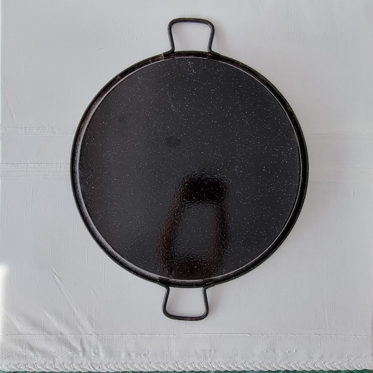
But what do you do if you don’t have a compass that can draw the outline for a supermoon? You just look for the biggest round household object you can put on the canvas. In my case, it was the largest of my five paella pans. The galaxy is already waiting for my others.
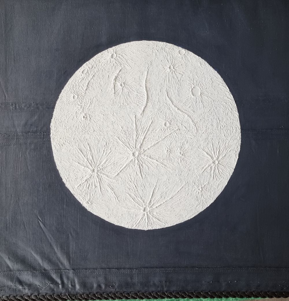
For the depth of the universe, the starry sky is primed once again in black with pure Paynes gray. The mixture of black, blue and red in the Paynes gray gives it a slightly bluish-violet appearance.
The idelae basis for a night sky and I do not even know if you can paint without Paynes gray at all.
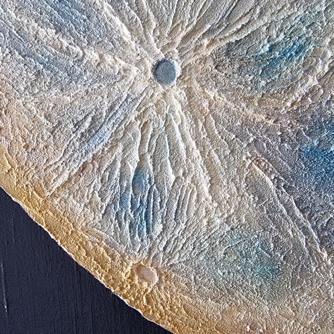
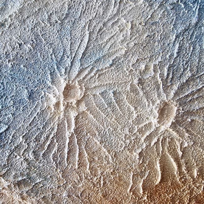
After the night sky, the surface of the moon is designed with texture paste. To the human eye, the moon simply looks like a flat bright disk with dark spots. In reality, the craters of meteorite impacts shape its form.
According to the shape of the moon, the face of the famous “man in the moon” is created. However the moon was formed, why should our satellite be gray when the earth and all other planets are colorful? Perhaps our image of the Moon is too much shaped by the images of the first lunar charge, where American astronaut Neil Armstrong famously said, ““One small step for a man, but one giant leap for mankind.”“
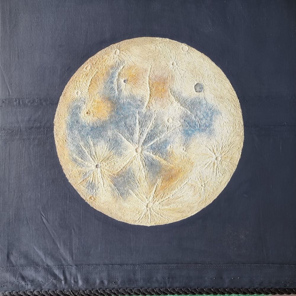
After the basic application of the colors follows an overpainting with transpartent metallic colors and the design of the starry sky.
